When you need a large format print, following a few pointers can ensure the finished product is extraordinary.
The original artwork you use is the most critical piece of the puzzle. In large format printing, clarity is vital, so everything begins with solid clipart.
Printing Design Tips
A well-balanced and thought-out sign printing design combined with a straightforward and easy-to-read message is likely to yield more results than a haphazard sign with little planning behind it.
The purpose of wide extension signs is to capture the attention of people from a distance. While you might get drawn to fanciful fonts; readability is the name of the game.
Select easy-to-read font styles, combine them with strong brand messaging, and you cannot go wrong. Generally, San Serif font families are always a safe bet for balancing style and readability.
Always avoid crowding letters and aim to leave approximately 1/3 of your print space empty.
Color Selection
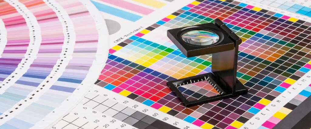
Color psychology is a fascinating topic. In digital printing projects, you will want to have enough contrast that people can read and elicit an emotional response. Dark, vivid colors are best for backgrounds and backdrops: lighter colors and white work well in text for reading at distance.
The simpler you keep it, the better!
Professional Sign Printing Services Removes The Guesswork
Of course, when you need sign printing done right, working with SWBP, the leading Dallas Print Shop, ensures your printing job gets done right.
M-F 8:00 am - 5:00 pm
4833 Cash Rd
Dallas, TX 75247
P: (214) 939-0546
© All Rights Reserved By Southwestern Blueprint